In the world of athletic wear, where trends come and go faster than a sprint, the New Balance logo has managed to stay remarkably consistent. It doesn’t scream for attention. It doesn’t change with every design trend. Yet, it speaks volumes about performance, reliability, and timeless design.
Let’s take a look at how this simple “NB” mark became one of the most iconic and trusted logos in the sportswear industry.
1. A Quiet Symbol of Performance
The New Balance logo isn’t flashy. It doesn’t rely on mascots or complex design gimmicks. Instead, it conveys movement, structure, and speed—three essential elements for any serious athlete. Since 1972, the monogram has stood as a symbol of confidence, quality, and balance.
This article explores the full NB logo history and how it reflects New Balance branding philosophy.
2. From Arch Supports to Athletic Empire
Founded in 1906 in Boston by William J. Riley, New Balance started not as a sneaker company but as an orthopedic brand. Riley designed arch supports inspired by a chicken’s three-toed foot—believing that the best balance came from nature. That foundational idea is what gave the company its name: New Balance.
Over time, the brand shifted from arch-support products to performance footwear. By the mid-1900s, it had started making running shoes, walking shoes, and eventually full-scale athletic apparel. But even as it grew, the company stayed committed to one core principle: balance in design and performance.
3. The Evolution of the New Balance Logo
1972–2006: The Bold Beginning
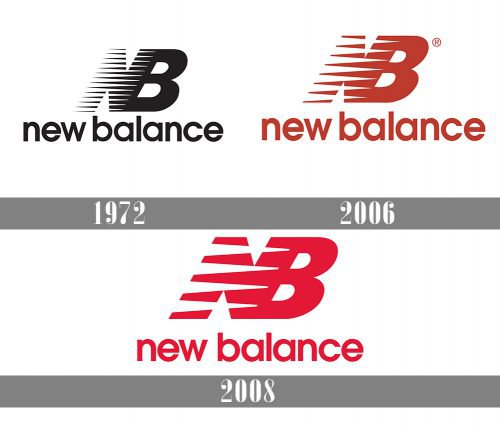
The first major logo redesign came in 1972, when New Balance unveiled its now-famous NB monogram. Designed by Terry Heckler, the tilted “N” featured 12 speed lines to suggest motion and energy. Paired with a bold “B” and a lowercase “new balance” wordmark, it struck a perfect mix of movement and stability.
This marked the start of the New Balance logo evolution, a journey of refining visual identity without ever losing brand essence.
2006–2008: A Digital-Ready Refresh
In 2006, the logo was updated. The speed lines were reduced to seven, making the logo cleaner and more versatile—ideal for digital and print. The red-and-black color palette added contrast and visibility, while retaining the logo’s recognizability.

2008–Present: Refined for Modern Versatility
By 2008, the design saw another refinement: now featuring five speed marks and a more streamlined look. Today, New Balance uses both the standalone “NB” monogram and the full “New Balance” wordmark in different contexts. The current logo is clean, bold, and built for everything from sneakers to mobile apps.

4. What Does the New Balance Logo Mean?
At first glance, it’s just two letters. But the New Balance logo carries layers of meaning:
- The “N” doesn’t just stand for New Balance; it also represents new beginnings.
- The speed lines evoke motion, athleticism, and forward progress.
- The contrast between the moving “N” and the stable “B” reflects balance—a harmony of innovation and tradition.
This smart, symbolic structure has helped New Balance maintain an identity that’s deeply rooted in performance. If you’ve ever wondered what does the New Balance logo mean, it’s all about trust, movement, and heritage.
5. Font, Colors, and Design Elements
- Font: The brand uses ITC Avant Garde Gothic Demi-bold—a modern, readable sans-serif typeface that balances sportiness with clarity.
- Colors:
- Red = energy, visibility, and athletic power
- Black = strength, dependability
- White = minimalism, clarity
- Design Versatility: The logo works just as well on a shoe, a hoodie, or a billboard. It’s scalable, recognizable, and adaptable.
6. More Than Just a Sportswear Brand

Unlike flashier brands, New Balance built its identity on consistency and craftsmanship. The New Balance logo doesn’t chase hype—it earns loyalty. It’s a favorite among:
- Runners and athletes
- Sneakerheads who appreciate low-key design
- Streetwear fans who value substance over status
The logo is a badge of authenticity—a mark that says, “this brand is built to last.” That’s the heart of strong New Balance branding.
7. Fun Facts You Might Not Know
- The brand’s name came from the founder’s observation of how chickens maintain perfect balance.
- Terry Heckler New Balance connection: he also designed the original Starbucks logo.
- New Balance is one of the few major sneaker brands that still manufactures in the USA and UK.
- The logo design helps fight counterfeiting thanks to subtle, unique features.
8. Endurance Through Design
What makes the New Balance logo stand out is how little it has changed over time. While competitors rebrand often, New Balance has stuck with its core design principles. That stability is part of what makes the logo so respected.
It’s a case study in thoughtful branding: evolve just enough to stay relevant, but never lose your soul.
9. Final Thoughts: Built to Move, Built to Last
In a world full of logos trying to shout, the New Balance logo quietly endures. It moves forward without losing its footing. It balances innovation with authenticity. And most importantly, it proves that great design doesn’t have to be loud to be unforgettable.
Whether it’s on a runner’s heel or a hoodie on the street, the NB monogram continues to deliver one message loud and clear: this is performance you can trust.
