The Buick logo is more than just a car badge it’s a visual symbol of legacy, quality, and innovation. As a proud division of General Motors (GMC), Buick has updated its emblem many times since its founding in 1904. Each transformation of the Buick symbol tells a story of the brand’s evolution—from ornate crests to sleek, digital-age tri-shields aligned with the electric vehicle (EV) future.
In this article, we’ll explore the complete Buick logo history, examine the meaning of the Buick logo, and uncover the reasons behind each design change—while placing Buick’s transformation in the context of its parent brand, GMC.
Meaning of the Buick Logo

The meaning of the Buick logo lies in its heraldic roots and symbolism. The tri-shield reflects unity, performance, and elegance. Its origins in David Buick’s family crest ground the brand in legacy, while each shield’s color (red, silver, and blue) reflects energy, quality, and trust.
Modern updates have transformed it into a clean, bold design that bridges the brand’s past with its electrified future.
The Early Years: Setting the Foundation (1904–1930)

The Globe Emblem (1904–1905)
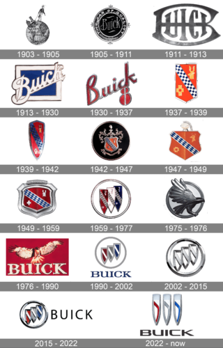
Buick’s earliest logo was a sepia-toned globe featuring a man, symbolizing global reach and craftsmanship. Though primitive, this Buick badge reflected the ambition of a pioneering auto brand.
Wordmark & Script Designs (1905–1930)
Buick soon introduced a round badge with the slogan “The Car of Quality,” followed by a stylized “B,” and later, a diagonal cursive “Buick” across a blue square. These early Buick emblems established the brand’s identity with elegance and flair.
Crest & Tri-Shield Era: Heritage Takes Form (1937–1959)
Family Crest Influence
In 1937, Buick began using heraldic symbols drawn from founder David Buick’s Scottish family crest—featuring a stag, cross, and checkered patterns.
Tri-Shield Debut (1959)
A major milestone in Buick logo history came with the tri-shield design. It represented Buick’s three main models of the time—LeSabre, Invicta, and Electra—and introduced the circular format that became iconic.
This version laid the groundwork for future Buick logo evolution, combining legacy and brand recognition.
Experimentation and Refinement (1960–2002)
Buick Hawk Emblem (1975–1980)
For a brief period, Buick used a hawk symbol, mainly on the Skyhawk model. This marked a rare deviation from the tri-shield and introduced a bold new visual direction.
Return to the Tri-Shield (1980–2002)
Buick quickly returned to its roots, reinstating the tri-shield with silver metallic outlines and deep blue backgrounds. The Buick logo design during this era featured modern typography and a clean, professional look.
Digital Modernization (2002–2022)
3D Chrome Styling (2002–2015)
Buick adopted a high-gloss chrome tri-shield with a 3D appearance—well-suited for digital platforms and car grilles alike. This version of the Buick badge added sophistication and realism.
Refined Colors Return (2015–2022)
In a nod to tradition, the red, silver, and blue colors were reintroduced. This update balanced modern aesthetics with heritage values, enhancing the Buick symbol for a new era.
2022 Redesign: A Logo for the Future
Frameless, Futuristic Identity
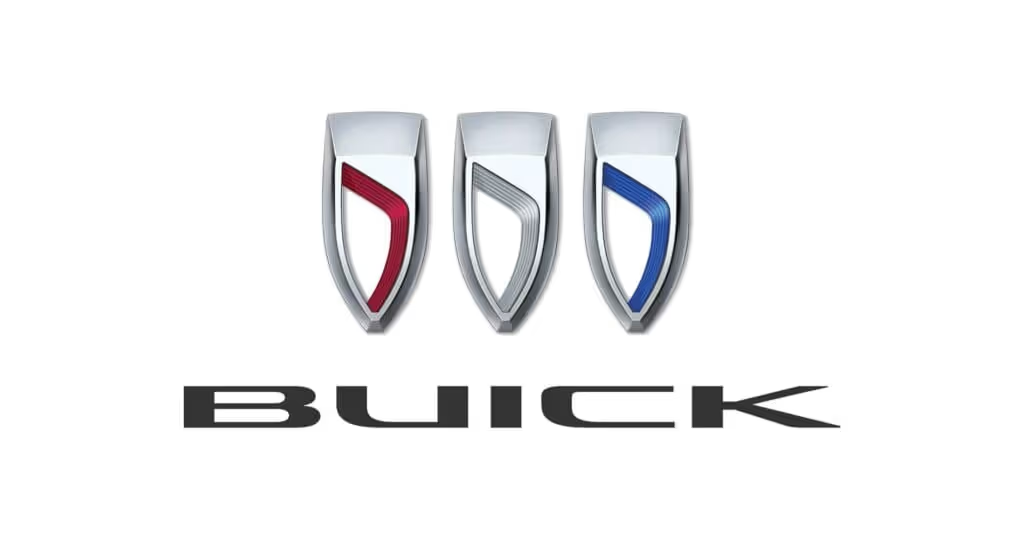
In 2022, Buick launched its most dramatic redesign in decades. The tri-shields were reimagined in a frameless, horizontal layout, representing motion and innovation. This version first appeared on the Buick Wildcat EV, signaling the brand’s entrance into the electric era.
Designed for the Digital & EV Age
This new Buick emblem was created over six years, with attention to lighting, reflection, and texture—ensuring strong performance in both physical and digital environments. It’s a sleek evolution that aligns with Buick’s forward-thinking strategy.
Conclusion
The Buick logo evolution is a timeline of American design and innovation. From ornate globes to sleek digital-age tri-shields, the Buick symbol captures 120+ years of craftsmanship and progress.
Today’s frameless Buick emblem honors its roots while embracing the future—firmly placing Buick in the spotlight as a luxury brand ready for the electric era. Whether you’re a longtime Buick enthusiast or discovering its story for the first time, the Buick badge remains a proud icon in the world of automotive design.
Frequently Asked Questions About the Buick Logo
1. What does the Buick logo mean?
The Buick logo symbolizes strength, tradition, and innovation. The tri-shield is rooted in the Scottish family crest of founder David Buick and originally represented three iconic models: LeSabre, Invicta, and Electra.
2. Why did Buick change its logo in 2022?
The 2022 redesign introduced a modern, frameless, horizontally aligned tri-shield. It reflects Buick’s transition to electric vehicles and a digital-first brand identity.
3. How many times has the Buick logo changed?
The Buick logo has gone through over 10 major changes since 1904, from script-based emblems to modern 3D shields, mirroring the brand’s evolution through each era.
4. What do the colors in the Buick emblem represent?
Red, silver (or white), and blue symbolize performance, precision, and trust—core attributes of the Buick brand. These colors are frequently featured in the Buick badge for visual appeal and national pride.
5. Where is the new Buick logo used?
The 2022 version of the Buick logo is used on all new models, especially electric vehicles like the Wildcat EV concept, and across Buick’s branding materials worldwide.
