
The Carolina Panthers logo is more than just a team symbol — it’s a fierce representation of pride, performance, and the unbreakable bond between two states. As one of the more recognizable logos in the NFL, the Panthers’ emblem has evolved over the years, yet it continues to reflect strength, regional identity, and innovation. In this article, we’ll explore the complete journey of the Carolina Panthers emblem, how it has shaped the team’s image, and why it stands tall among iconic franchise logos.
1. Origins of the Carolina Panthers Logo
When the Carolina football team logo was first created in 1993, the franchise was a fresh addition to the league. Designed by NFL Properties, the logo introduced a snarling black panther — a predator native to the Carolinas. One of the most fascinating elements was how the shape of the panther’s head subtly resembled the outlines of North and South Carolina, reflecting the franchise’s commitment to both states (team history).
This regional symbolism gave the Panthers a powerful start in terms of team identity design.
2. Primary Logo Evolution
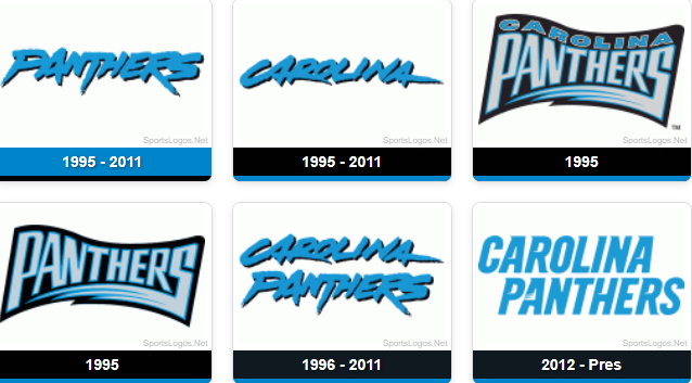
1995–2011: The Original Emblem
The original Carolina Panthers logo debuted in the team’s inaugural 1995 season. It featured a jagged, aggressive panther head outlined in black and accented in blue and silver — an unmistakable mark of intensity and competitive spirit.
2012–Present: Sleek Redesign
In 2012, the team made a subtle update to the logo (ESPN source). The new version, refined by Nike, featured cleaner lines, updated facial features, and a slightly deeper shade of blue. The redesign didn’t reinvent the logo — it modernized it while keeping the franchise’s essence intact. This was a textbook case of smart evolution in NFL logo design.
3. Symbolism and Color Meaning
Every element of the Carolina Panthers emblem is carefully chosen:
- Black symbolizes strength and intensity.
- Blue conveys loyalty and unity.
- Silver/Grey adds a modern, high-tech feel.
These colors aren’t just for looks. According to logo color psychology, each shade plays a key role in audience perception. Combined with the panther’s fierce expression and dynamic shape, this is a standout in sports logo design.
4. Wordmark and Typography Logos
Alongside the panther icon, the team has also evolved its wordmark logos — from traditional block fonts to today’s bold, italicized lettering. These wordmarks match the energy and motion of the panther graphic, creating visual consistency across branding, merchandise, and broadcasts.
5. Alternate and Secondary Logos
Over the years, simplified or modified versions of the primary logo have appeared on merchandise and media platforms. These alternate logos provide flexibility while maintaining core identity. You can view many of them on SportsLogos, where they’re archived in visual timeline format.
6. Throwback, Anniversary & Special Logos
For milestone moments, the Panthers have introduced special edition logos, typically as patches or limited-time graphics. These include anniversary years and key achievements. Though not part of the core design, these variants are a celebrated part of the broader NFL logo evolution.
7. Uniform & Helmet Logo Integration
From day one, the Carolina Panthers logo has appeared on the team’s silver helmets — accented with black and blue stripes. In 2012, the helmet was updated slightly to reflect the redesigned logo. This consistent and polished look reinforces the team’s visual presence every time they take the field.
8. Public & Fan Reactions
Reactions to the 2012 update were mostly positive. Fans appreciated that the logo was improved — not overhauled — staying true to its roots while making it sharper and more scalable for digital use. Articles like Bleacher Report’s logo rankings regularly mention the Panthers as having one of the strongest and most balanced visuals in the league.
9. Legacy and Branding Impact
Today, the Carolina Panthers logo is not just a football symbol — it’s part of a broader cultural and branding identity. Whether seen on merchandise, helmets, or social media, it delivers a powerful message: unity, pride, and passion. The logo is often highlighted in NFL branding case studies for how it combines tradition with innovation so effectively.
10. Conclusion
The Carolina Panthers logo stands as one of the most respected symbols in professional sports. It reflects the team’s origin, growth, and identity, all within a sharp, aggressive, and modern design. From its regional symbolism to its visual evolution, the logo is a case study in effective team identity design.
Its legacy will continue to grow as part of the larger story of NFL logo evolution, reminding fans and designers alike how powerful a single image can be in shaping an entire franchise.