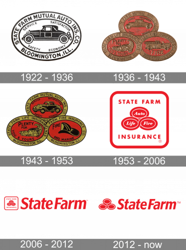
State Farm, one of the largest insurance providers in the United States, has built a strong brand identity over the past century. A core part of that identity is its instantly recognizable State Farm logo. From modest beginnings to sleek, modern branding, the State Farm logo has mirrored the company’s growth and adaptation in a competitive market. It has evolved not just as a visual mark, but as a powerful symbol of the company’s mission to offer protection and reliability.
Evolution of the State Farm Logo Over the Years
Understanding the historical transformation of the State Farm logo offers a glimpse into how the brand has responded to changing design trends, market dynamics, and communication needs.

1922 – 1936
State Farm’s original logo design was a simple, straightforward wordmark that emphasized professionalism and trust. The design reflected the company’s foundational goals of offering affordable and dependable insurance coverage.
1936 – 1943
As the company grew, the State Farm logo underwent minor adjustments to refine the typography. These enhancements aligned with broader corporate branding trends, helping the logo appear more polished and trustworthy to the consumer.
1943 – 1953
In the post-war era, the logo was further refined to ensure better visibility and project a strong professional image. This phase marked a gradual shift toward a more defined and recognizable visual identity.

1953 – 2006
This period introduced the iconic version of the State Farm logo featuring a trio of interlocking ovals labeled Auto, Life, and Fire. This distinctive symbol became a cornerstone of the company’s brand recognition, visually communicating the range of services and the stability of the brand.
2006 – 2012
To modernize its appearance while retaining core elements, the logo received a contemporary update. Cleaner lines and a compact layout improved logo scalability, making it more effective across print and digital platforms.
2012 – Present
In response to the digital era’s demand for simplicity and flexibility, State Farm adopted a minimalist logo design. The revamped logo retained the essence of the three ovals but adopted a more streamlined appearance. Paired with a bold, custom sans-serif typeface, this version reinforces the brand’s accessibility and relevance in a modern context.
Logo Meaning and Symbolism
Each element in the State Farm logo carries symbolic meaning, reinforcing the company’s mission and values.

What are the 3 circles in the State Farm logo?
The three interlocking ovals represent State Farm’s foundational services: Auto, Life, and Fire insurance. These elements are visually connected to symbolize comprehensive coverage and cohesive service.
What is the symbol for State Farm?
The current branding symbol—a simplified version of the three-oval logo—acts as a visual shorthand for the company. It’s instantly recognizable and optimized for digital clarity, while still honoring the company’s historic roots.
What is State Farm’s catchphrase?
“Like a good neighbor, State Farm is there.” This catchphrase isn’t just an advertising slogan—it encapsulates the company’s customer-first philosophy and has become deeply associated with the State Farm logo and overall brand identity.
State Farm Logo Font
Typography plays a crucial role in establishing brand tone. The custom sans-serif font used in the current logo is bold, clear, and professional. It aligns with modern branding standards and ensures the company appears reliable and forward-thinking across all touchpoints.
State Farm Logo Colors
Color is central to the effectiveness of the State Farm logo. The consistent use of a red-and-white color scheme communicates urgency, trust, and visibility. Red represents strength and assurance, while white conveys simplicity and openness—together, they project a warm and dependable image.
Conclusion
The State Farm logo represents more than just visual branding; it tells a story of growth, adaptability, and enduring trust. From a plain wordmark to a nationally recognized trio of ovals, and finally to a sleek, minimalist symbol, each iteration has served to reinforce the company’s mission and values. Its enduring design choices—from colors and font to symbolic shapes—have helped State Farm remain a leader in brand recognition in the insurance industry. As visual branding evolves with technology, the State Farm logo continues to stand out as a model of strategic and meaningful design.


