The Rutgers logo is more than just a university emblem—it’s a symbol of academic excellence, historical legacy, and New Jersey pride. As the visual identity of one of the oldest institutions of higher education in the United States, the Rutgers logo has undergone subtle yet meaningful changes while staying rooted in tradition. In this article, we explore the logo’s history, meaning, symbolism, key achievements of the university, and wrap up with a powerful conclusion.

History of the Rutgers Logo
Founded in 1766, Rutgers University is the eighth-oldest college in the United States. Originally chartered as Queen’s College, the school was renamed Rutgers College in 1825 in honor of Colonel Henry Rutgers, a Revolutionary War hero and philanthropist.
Over the centuries, Rutgers’ identity evolved, and so did its branding. Early logos were often based on seals and Latin inscriptions, consistent with 18th and 19th-century academic traditions. The current logo, introduced in the early 2000s, marked a departure from ornate seals to a more modern, clean, and professional wordmark that appeals to a broader audience.
Key Milestones in Logo Evolution:
Pre-1900s
Rutgers, then known as Queen’s College, used traditional Latin seals and classic academic crests, reflecting its colonial heritage and scholarly foundation.
1825
The college was renamed Rutgers College in honor of Colonel Henry Rutgers. The seal was updated to reflect the new name while keeping the Latin motto and scholarly emblems intact.
1950s–1960s
As the university expanded post–World War II, Rutgers began experimenting with modernized versions of its seal. These early designs blended traditional elements with cleaner fonts for use in official documents.
1970s–1980s
During this period, Rutgers introduced more versatile hybrid logos—mixing serif typography with shield or seal motifs—used for both academic and administrative branding.
1990s
The school gradually moved away from complex seal designs for everyday use, leaning toward simplified text-based logos that emphasized legibility and clarity, especially in print materials.
2006
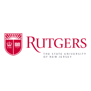
A major rebranding effort led to the launch of the current Rutgers wordmark—a bold, red, serif-styled logo that features “RUTGERS” in all caps. This design aimed to create a strong, consistent identity across all campuses and departments.
Present Day
The wordmark remains the core logo for the university, supported by the widely recognized block “R” monogram for athletics and school spirit branding. The clean, unified style helps position Rutgers as both a historic and forward-thinking institution.
Meaning Behind the Rutgers Logo
At its core, the Rutgers logo reflects the university’s heritage, excellence, and inclusivity. The bold serif typeface conveys tradition and academic seriousness, while the red color—Rutgers Scarlet—is a symbol of passion, leadership, and strength.
The simplified logo allows Rutgers to project a global, unified brand that is easily recognizable across print, digital, and athletic platforms.
Symbolism in the Rutgers Logo

Though minimal in appearance, the Rutgers logo carries deep symbolic meaning:
- Color (Scarlet Red): Represents courage, vitality, and the school’s athletic nickname, the Scarlet Knights.
- Typeface: A classic serif font denotes tradition, academic authority, and stability.
- “R” Monogram (Athletics Logo): Used widely in sports branding, the bold “R” is instantly associated with Rutgers pride and school spirit.
Together, these elements form a versatile and dynamic identity system that speaks to Rutgers’ long-standing history and forward-looking vision.
Achievements Represented by the Logo
The Rutgers logo is not just a symbol—it stands behind an institution with a legacy of academic, research, and social achievements. Some of the major accomplishments include:
| Category | Achievement |
|---|---|
| Academics | Member of the Association of American Universities (AAU) |
| Research | Over $750 million in annual R&D expenditures |
| Athletics | Founding member of college football (1869) |
| Innovation | Home to cutting-edge biotech, AI, and climate research |
| Diversity | Among the most diverse campuses in the U.S. |
| Global Reach | Partnerships with institutions in more than 130 countries |
These achievements are reflected through the use of the logo on diplomas, research publications, sports uniforms, and official communications.
Conclusion
The Rutgers logo is more than a piece of graphic design—it’s a visual representation of a 258-year journey of resilience, growth, and global impact. Whether emblazoned on the side of a football helmet or displayed on academic regalia, the logo serves as a badge of honor for students, faculty, alumni, and supporters.
As Rutgers continues to expand its influence in education, innovation, and civic engagement, its logo will remain a powerful and enduring symbol of excellence, deeply rooted in tradition while boldly facing the future.
Download a vast collection of Rutgers Logo include ( Rutgers logo png, Rutgers logo knight, Rutgers logo design, Rutgers logo vector, Rutgers logo SVG, Rutgers Business School logo, Rutgers logo download and Rutgers logo history)


