From a winking pirate face to a skull-and-sabers Jolly Roger, the Buccaneers logo has undergone a dramatic journey that mirrors the team’s identity and visual branding evolution. Tampa Bay’s first logo debuted with the expansion franchise in 1976 and (after subtle tweaks) lasted two decades. That original emblem – nicknamed “Bucco Bruce” – was drawn by local cartoonist Lamar Sparkman, a member of Tampa’s Gasparilla pirate parade society. It shows a hoop-eared pirate wearing a plumed slouch hat and clasping a dagger in his teeth, one eye cheekily winking. (Sparkman deliberately gave Bruce a wink instead of the usual eyepatch to avoid copying the Oakland Raiders’ logo.) Bright Florida orange and red made up Bucco Bruce’s color scheme – the orange honored Tampa’s citrus heritage, while red added punch.
Even within that first era, the iconic NFL logo was refined: in 1992 the artists cleaned up Bruce’s face (his previously closed eye was opened, the dagger’s detailing sharpened) for a crisper look. Still, the cartoonish pirate was more charming than fearsome – one sportswriter quipped that Bucco Bruce “struck fear in the hearts of no one.” In fact, the logo and its “Bucco Bruce” nickname became lighthearted symbols of the club’s underdog struggles. (Fans have long embraced the retro “creamsicle” orange throwback uniforms that match this era, complete with Bruce on the helmet.)
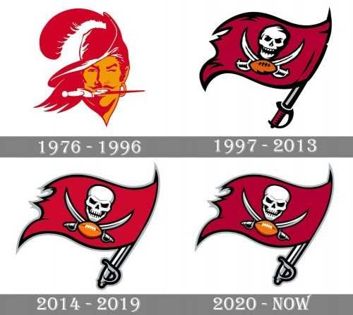
1976–1996 – Bucco Bruce: The Buccaneers’ original logo and vintage football design. A winking pirate drawn by Lamar Sparkman, with a red feather in his hat, hoop earring, and knife in his teeth. Primary colors were bright Florida orange and red (symbolizing sunshine and power) with white trim. This friendly-yet-rascal pirate face served as the team’s trademark for 20 seasons, even after a 1992 cleanup of the artwork. It became one of the most recognizable and nostalgic logos among NFL expansion teams of the 1970s.
Who Designed the Tampa Bay Buccaneers Logo?
The Buccaneers’ visual identity owes much of its personality to the creative minds behind its design. The original 1976 logo—known affectionately as “Bucco Bruce”—was crafted by Lamar Sparkman, a local Tampa Bay cartoonist and member of the Gasparilla pirate parade society. Sparkman intentionally gave the pirate a wink instead of an eyepatch to differentiate the look from the Oakland Raiders’ branding. His playful and stylized character set the tone for the team’s early, quirky image.
The 1997 redesign, which introduced the fearsome skull and sabers on a crimson flag, was the result of collaborative work between the Buccaneers’ front office and NFL Properties’ in-house design team, with additional input from advertising and branding agencies. The goal was clear: to move away from the lighthearted persona of Bucco Bruce and embrace a more intimidating image that aligned with the team’s competitive ambitions. While no single designer is credited, the effort was a high-profile internal rebranding project that drew from sports marketing expertise and trend analysis.
The 2014 and 2020 logo updates were again managed by NFL design consultants, who fine-tuned details like line thickness, color vibrancy, and digital scalability—all while staying faithful to the original 1997 template.
The Jolly Roger Flag: 1997–2013 Redesign
By the mid-1990s, the Buccaneers needed a new image. A 1996 stadium referendum kept Tampa Bay’s NFL team in town and prompted management to “develop a more marketable and intimidating look.” In 1997, the team ditched Bucco Bruce and unveiled a bold pirate flag logo, matching a new uniform and color scheme. The primary colors changed to red and pewter (a gray tone), with black and orange accents. The new flag logo features a wind-blown crimson pennant bearing a white pirate skull above crossed sabers; below the skull sits a small orange football (the flag’s “Jolly Roger” design). Even the font was updated – the team name was now written in a blocky “Totally Gothic” script on jerseys and marketing materials.
This dramatic redesign wasn’t just cosmetic. After enduring a league-worst record over 21 seasons, Tampa Bay’s ownership wanted to turn the page. The fierce new NFL team emblem reflected that shift. According to design analysts, this marked one of the most aggressive image overhauls in modern NFL history. The change was enthusiastically embraced as a break from the past: TV personality Chris Berman dubbed the team “the pirates in pewter pants” upon seeing the silver helmet with the new flag, and fans quickly adopted nicknames like the “Pewter Pirates.” The logo’s introduction was even celebrated with a tongue-in-cheek ceremony: in April 1997, the old Bucco Bruce mascot “walked the plank” on a pirate ship (only to be humorously pardoned by the governor).
From a design perspective, the 1997 logo’s composition is visually compact and symmetrical, a departure from the freeform portrait of Bucco Bruce. The rectangular flag shape and stylized skull made for a sharper, more modern badge. (Ironically, this white-on-crimson color scheme was similar to that of Tampa’s 1980s USFL team, the Bandits.) The rebrand paid off on the field as well: the Bucs became perennial playoff contenders in the 2000s and won their first Super Bowl in the red-flag era (2002 season). In many fans’ eyes, that transformation from lovable loser to champion was visually signaled by swapping out Bruce for the menacing skull flag.
1997–2013 – Crimson Flag & Skull: First introduced in 1997. The logo is a waving dark red (burgundy) flag with a white skull and crossed sabers, and an orange football beneath the skull. Colors are red, pewter (gray), black and orange. Symbolically, this “Jolly Roger” design was intended to look fierce and intimidating – a radical departure from the cheerful Bucco Bruce and a standout example of football logo evolution.
The 2014 Refresh: Smoother Skull & Brighter Detail
After 17 seasons with the skull-and-sabers flag, the Buccaneers made only minor refinements in 2014. The team introduced new uniforms and a slightly updated logo. The overall concept remained the same, but details were modernized for digital and broadcast clarity, aligning with trends in modern sports logos.
In the updated logo, the skull’s outline was slimmed and its features sharpened. The football under the skull got white laces instead of black for higher contrast, and the flag’s red was lightened from burgundy to a more vibrant red. All of the icon’s edges became thinner and cleaner, giving the composition a more “elegant and professional” look. The saber handle was recolored silver-gray to match the new helmet.
In short, the 2014 logo looks almost identical to the 1997 version at first glance, but sports a sleeker aesthetic. Fans were polarized by the uniform number font (mocked as “alarm-clock digits”), but the logo itself was widely seen as a faithful update of a classic design. After winning a Super Bowl in the pirate era, the Bucs didn’t want to stray far from that identity and legacy in NFL rebranding strategy.
2014–2019 – Modernized Skull on Red Flag: The 1997 logo with fine-tuning. The white skull remains above crossed sabers on a red flag, but with cleaner lines and details. Key tweaks: skull contours are smoother, football stitches turned white, and the flag’s red is lighter. The helmet became a darker pewter with a shiny chrome facemask, while orange reappeared as accent trim.
Return to Burgundy: The 2020 Logo
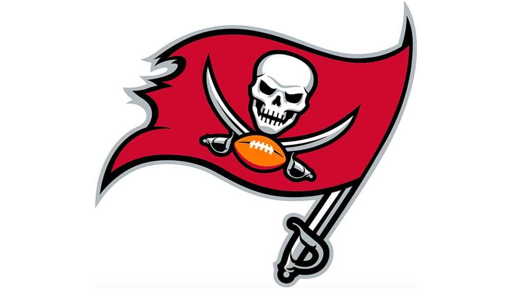
The only significant change in 2020 was color. For the 2020 season, the Buccaneers restored the burgundy flag from the 1997–2013 era, while keeping all other elements exactly as in the 2014–2019 version. In other words, the skull, sabers, and layout were untouched – the only difference was that the red flag went back to the deeper burgundy shade. The football is now a darker orange under the skull. This tweak aligned the logo with the team’s throwback-inspired uniforms and re-emphasized the team’s original color identity.
Notably, the timing coincided with a new championship era: the 2020 redesign was unveiled just weeks before Tom Brady’s arrival, and the Bucs famously won their second Super Bowl that season wearing the updated helmet. Whether intentional or not, the move evoked nostalgia and signaled that Tampa Bay valued its history. Designwise, the 2020 logo shows how much consistency remained: for a logo now 23 years old, retaining its exact form (aside from color) is unusually conservative in an era of frequent rebranding and shifting sports identity design.
2020–Present – Burgundy Flag & Skull: The current logo. Identical to the previous version except the flag color is now darker burgundy again. Colors: burgundy, pewter, orange, black, white. Symbolism: a nod to the classic look, merging the modern skull design with the original red tone. Its visual continuity has helped cement brand loyalty among a new generation of fans.
Home Ground Influence on Identity
The evolution of the Buccaneers’ logo is deeply intertwined with their home stadiums, which have played a pivotal role in shaping fan experience and reinforcing the team’s identity.
Tampa Stadium (1976–1997)

Known colloquially as “The Big Sombrero” due to its unique shape, Tampa Stadium was home to the Buccaneers during the team’s formative years. It was here that fans first embraced the creamsicle uniforms and the cheerful Bucco Bruce logo. Despite the team’s early struggles, the stadium developed a loyal fanbase and helped establish the Buccaneers’ brand within the Tampa Bay community. The stadium’s open-air design and proximity to downtown Tampa gave it a vibrant, regional energy that influenced the team’s early image.
Raymond James Stadium (1998–Present)
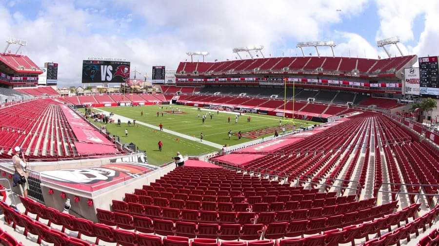
The opening of Raymond James Stadium marked a new era for the Buccaneers. Coinciding with the 1997 logo redesign, the stadium featured a massive pirate ship in one end zone—a bold branding move that connected the new skull-and-flag logo with game-day theatrics. Cannons firing after touchdowns and elaborate pirate-themed decor created a unique, immersive environment that helped cement the Bucs’ fearsome new identity. The stadium has since hosted multiple Super Bowls and remains a central part of the team’s marketing and fan culture.
The synergy between the stadium and the updated logo created one of the most cohesive sports identity design experiences in the NFL. With every redesign and uniform update, Raymond James Stadium has been the stage that amplifies and supports the evolving Buccaneers brand.
Helmet & Uniform Design Evolution

The Buccaneers’ helmets and uniforms have evolved alongside the logo, reinforcing the brand transformation at each stage.
1976–1996: The Creamsicle Era
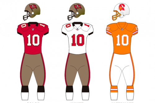
The original uniforms featured a bold and unconventional color palette: bright orange jerseys with white pants and red trim, paired with white helmets that showcased the Bucco Bruce logo. This look, often called the “creamsicle” uniform, was visually striking and unique in the NFL. The helmets used a simple white shell with a red facemask, maintaining consistency with the cheerful and less intimidating theme of the Bucco Bruce logo.
1997–2013: The Pewter Revolution
The rebranding in 1997 brought a total overhaul of the team’s appearance. The uniforms introduced pewter pants, dark red (burgundy) jerseys, and black accents. The silver (pewter-colored) helmets debuted with the new skull-and-sabers flag logo prominently displayed on each side. These metallic helmets featured a red facemask and embodied a modern, aggressive visual identity that matched the team’s rising success.
The combination of metallic pewter, crimson red, and jet black gave Tampa Bay one of the most memorable uniforms in professional football, earning praise for its distinctive visual impact.
2014–2019: Subtle Tweaks with a Bold Helmet
In 2014, the Bucs refreshed their uniforms to appear more futuristic. The pewter helmet remained but became darker with a chrome-effect facemask. The skull logo was slightly refined to improve clarity, and jersey fonts were changed to a digital-style, clock-like number design — a move that drew mixed reactions from fans. Orange made a limited return as an accent color, adding a nostalgic touch to the modern setup.
2020–Present: A Classic Reimagined

With the arrival of Tom Brady and a new championship era, the Bucs returned to a more traditional aesthetic in 2020. The uniforms retained the pewter-and-red identity but reverted to simpler designs inspired by the Super Bowl-winning look of the early 2000s. The helmets stayed pewter with a deep burgundy flag logo, reaffirming the strength and consistency of the Buccaneers’ visual brand. The return to this classic look was widely praised and coincided with the team’s second Super Bowl win.
Design Elements: Color, Shape & Typography
Color Psychology
From day one, the Bucs’ palette has been intense and distinctive. Florida orange has always featured prominently. The post-1996 era introduced red and pewter as primaries, with accents of black and white. By 2020, the official color scheme settled into “buccaneer red” (a deep burgundy), gray (pewter), orange, white and black. These choices align with the visual strategies found in effective NFL logos.
Shape & Symbolism
The early logo’s shape is organic (a pirate head profile), whereas the flag logo has a strong rectangular form. The skull-on-a-flag motif is a deliberate reference to classic pirate imagery. Placing the skull atop an orange football creatively blends the pirate theme with football symbolism. Over time, outlines were refined: the 2014 update, for example, uses a thinner stroke around each element, giving a sleeker silhouette found in top-tier sports branding.
Typography
Unlike some sports logos, the Buccaneers’ mark itself contains no letters – there is no wordmark built into the flag logo. (The team does use a separate custom font called “Totally Gothic” for its wordmark and jerseys, introduced in 1997, but the skull-and-flag icon stands alone.)
Cultural and Branding Impact
Each Buccaneers logo has carried cultural weight for fans and the franchise. The original Bucco Bruce became a cult icon despite the team’s poor record. The new skull flag instantly became associated with a winning shift. The logos have appeared on countless merchandise, reinforcing team branding and sports marketing identity. The team’s official mascots reflect this heritage too: Bucco Bruce and Captain Fear.
Each redesign also aligned with a branding narrative. The 1997 logo launch coincided with a new stadium and a rebranding campaign; the 2014 tweak coincided with a uniform unveil after the franchise’s first championship.
Logo Evolution in the NFL Context

Compared to other teams, the Buccaneers’ logo path is fairly dramatic. Some franchises (Green Bay, Dallas) have barely changed their logos in decades. Others (New England, Washington) replaced pictorial mascots with stylized logos around the 1990s. The Bucs stand out for completely scrapping their original mascot for a brand-new symbol in 1997 – a bold move in the world of iconic NFL logos.
Conclusion
The evolution of the Tampa Bay Buccaneers logo is a story of changing identities – from a playful pirate to a fearsome Jolly Roger – and all the culture in between. Designers can admire how the Bucs balanced continuity and change. Sports fans see these logos as emblems of different team eras. Historians note how each redesign reflects regional flavor and the franchise’s fortunes.
As a result, the Buccaneers’ emblem remains one of the most distinctive in the NFL. Whether it’s on a retro cream-colored jersey or the current silver helmet, the logo remains a strong case study in successful football rebranding and sports logo history.
