When you think of fast food branding that’s instantly recognizable, the Chick-fil-A logo undoubtedly comes to mind. With its friendly cursive script and playful chicken imagery, the logo represents more than just chicken sandwiches—it conveys hospitality, tradition, and a refined sense of brand identity. Over the decades, the Chick-fil-A logo has evolved subtly, yet meaningfully, staying true to the brand’s values while refining its visual presence in the competitive fast food world.
In this blog post, we’ll explore the origins of the Chick-fil-A logo, break down its evolution across decades, and explain the meaning behind its signature design elements.
1. Brand Origins, History & Early Identity (1946–1964)
The history of the Chick-fil-A logo is closely tied to the brand’s origin story. Chick-fil-A’s journey began in 1946 when founder S. Truett Cathy opened a modest diner called Dwarf Grill in Hapeville, Georgia. It wasn’t until 1961 that the name “Chick-fil-A” emerged—cleverly combining the words “chicken” and “Grade A” to reflect the company’s commitment to premium quality food and service.
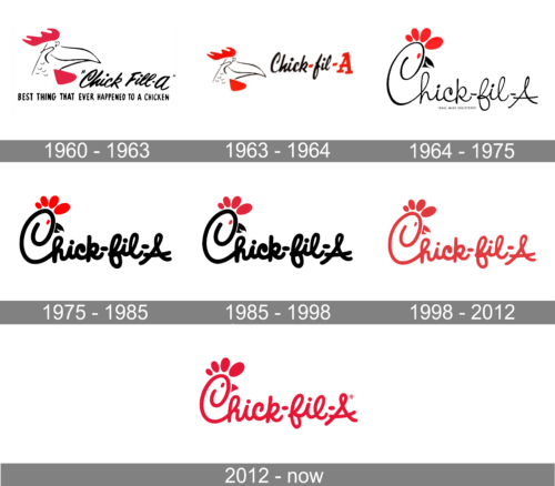
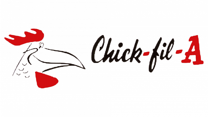
The brand’s first logo debuted with a quirky touch: a hand-drawn cursive font spelling out “Chick-fill-A”, featuring a smiling chicken mascot named Doodles. Accompanied by the tagline “The Best Thing That Ever Happened to a Chicken,” it reflected the brand’s warm, family-friendly beginnings.
This early design set the tone for the company’s brand personality: approachable, humorous, and wholesome. The logo was more than just a name—it was a visual promise of high standards and Southern hospitality. The introduction of the chicken mascot and playful typography helped the logo stand out and made it memorable, even in its humble beginnings.
2. Logo Milestones: Evolution Through the Decades
As Chick-fil-A expanded its footprint across the U.S., its logo underwent thoughtful changes to reflect its maturing identity. Each phase of its visual transformation balanced modern branding needs with a commitment to the brand’s core values. Here’s a closer look at the key milestones in the evolution of the Chick-fil-A logo:

🔸 1963–1964: Simplification Begins
In this period, the brand refined its name and design elements. The spelling was updated from “Chick-fill-A” to “Chick-fil-A” for clarity and memorability. Red hyphens were introduced to add rhythm and emphasize quality, while the capital “A” subtly hinted at the “Grade A” standard the brand promises. The playful Doodles mascot was retired, and the logo moved toward a cleaner, more mature look.
🔸 1964–1975: The Chicken Takes Shape
One of the most recognizable updates occurred when the brand incorporated a chicken’s head into the “C” of “Chick.” This clever design included a comb, beak, and eye, transforming the letter into a visual symbol of the company’s core product—chicken. This visual pun gave the logo a unique personality while staying simple and readable.
🔸 1975–1985: Friendly & Bold
To improve visibility on signage and packaging, the script font was thickened. The new, bolder cursive added approachability and warmth, aligning with the brand’s hospitable image. This era introduced a more casual, handwritten flair that helped Chick-fil-A stand out from competitors.
🔸 1985–1998: Refinement Phase
As Chick-fil-A’s footprint expanded nationally, the logo evolved with it. A richer red color replaced earlier versions, making it more visually compelling. The script was refined for better print reproduction, offering a sleeker, more professional image without losing its charm.
🔸 1998–2012: Going Monochrome Red
In a major aesthetic shift, the logo was converted to an all-red design, removing its black outlines. This unified color scheme improved its versatility across media—whether on packaging, uniforms, or advertising. Red, known to stimulate appetite, reinforced Chick-fil-A’s position in the fast food space.
🔸 2012–Present: Modern Minimalism
In its current form, the Chick-fil-A logo is a masterclass in subtle evolution. Small adjustments were made to close the beak, refine the lines, and enhance digital legibility. The addition of the ® symbol reflects the brand’s emphasis on trademark protection and visual consistency. Today’s logo is clean, scalable, and instantly recognizable—suited for both billboards and smartphone screens.
3. Design Meaning and Visual Symbolism

🐔 The Chicken in the “C”
One of the most iconic features of the logo is the chicken-shaped “C.” The design includes a comb (top), an eye, and a beak—all seamlessly integrated into the letterform. This clever detail gives the logo personality and immediately signals the brand’s poultry roots.
✍️ Font Choice
The cursive, script-style lettering resembles handwriting, creating a feeling of warmth and familiarity. It evolved over the years into a custom typeface while retaining its welcoming nature.
🎨 Color Psychology
Red is known to stimulate appetite, evoke passion, and grab attention. Combined with a white background, it creates a clean, modern, and energetic brand aesthetic.
This section answers the popular query: “What does the Chick-fil-A logo mean?”
4. Branding Strategy & Cultural Consistency
Beyond visuals, the Chick-fil-A logo serves as a symbol of the company’s unwavering branding philosophy. Throughout the years, the business has positioned itself as a faith-driven, family-friendly brand. This sense of purpose is reflected not only in their customer service and operations—such as remaining closed on Sundays—but also in their visual identity.
The design of the logo, especially the distinctive capital “A,” subtly reinforces the brand’s promise of “Grade A” quality. It’s a visual cue that excellence is part of their DNA. Even as the logo underwent subtle changes to stay relevant in modern markets, its consistent use of script typography, red color, and chicken symbolism ensured that its identity remained instantly recognizable.
This consistency across decades has helped Chick-fil-A build strong emotional connections with its audience. Whether through signage, packaging, or digital platforms, the logo signals more than food—it reflects integrity, heritage, and reliability. The result is a brand that not only stands out but also stands firm in its values.
5. “Eat Mor Chikin”: The Iconic Campaign
In 1995, Chick-fil-A introduced one of the most memorable and unconventional marketing campaigns in fast food history—the “Eat Mor Chikin” campaign. Featuring mischievous cows holding up poorly written signs that urge people to eat chicken instead of beef, the campaign quickly became a cultural phenomenon.
The genius of this campaign lies in its humor, simplicity, and alignment with Chick-fil-A’s brand voice. By using cows as spokescharacters (or rather, anti-beef mascots), the brand created a funny and endearing narrative that didn’t require heavy explanation. The misspelled phrase, “Eat Mor Chikin,” became instantly recognizable and deeply associated with Chick-fil-A’s identity.
Importantly, the campaign complemented rather than overshadowed the core logo. While the cows became icons in their own right, the company never replaced its logo or visual identity with the campaign. Instead, both worked hand-in-hand: the cows drove engagement and pop culture appeal, while the logo reinforced trust and brand consistency.
This strategic balance of playful marketing with visual continuity showed that Chick-fil-A understood how to create advertising that entertains without compromising brand integrity. The “Eat Mor Chikin” cows remain one of the most beloved and effective marketing tools in fast food history.
6. Trademark Protection & Visual Integrity

As the Chick-fil-A brand expanded and became more recognizable, protecting its visual identity became increasingly important. The company took strategic steps to safeguard both its iconic logo and brand-associated phrases.
One of the most significant moves was trademarking the quirky and beloved phrase “Eat Mor Chikin.” This ensured that the cows and their humorous messaging remained exclusively associated with Chick-fil-A’s branding and couldn’t be legally imitated by competitors.
In 2012, another critical branding milestone occurred: the addition of the ® (registered trademark) symbol to the Chick-fil-A logo. This marked a formal declaration of legal ownership and sent a clear message that the brand’s identity was protected at the highest level.
To maintain consistency across thousands of locations, Chick-fil-A enforces strict usage guidelines for its logo and marketing visuals. This includes everything from color matching and typography to placement on uniforms, signage, and digital platforms.
Key elements of Chick-fil-A’s trademark strategy include:
- ✅ Trademarking and protecting the “Eat Mor Chikin” slogan
- ✅ Registering the logo with a ® symbol to reinforce legal ownership
- ✅ Enforcing consistent use of the logo across all locations
These actions not only prevent misuse but also reinforce customer trust. By protecting the visual integrity of the logo, Chick-fil-A ensures that their branding remains recognizable, respected, and resilient in an increasingly competitive market.
Conclusion
The Chick-fil-A logo stands as a shining example of how consistent branding, strategic design decisions, and deep-rooted values can converge to create a timeless visual identity. Over the decades, the logo has not only adapted to meet modern aesthetics and digital requirements but has also preserved the core essence of the brand—faith, friendliness, and food quality.
From its humble beginnings featuring a chicken mascot named Doodles to the present-day sleek, minimalist logo, every iteration tells a part of Chick-fil-A’s brand journey. The logo’s evolution has been gradual and thoughtful, allowing the brand to grow without ever feeling disconnected from its origins. It has maintained the warmth of its cursive script, the playful yet sophisticated chicken imagery, and the inviting color scheme that all together make it unmistakably Chick-fil-A.
What makes the Chick-fil-A logo especially successful is its emotional resonance. It’s not just a logo; it’s a beacon of consistency, quality service, and cultural integrity. Whether spotted on a highway billboard or a smartphone app, it evokes trust and familiarity.
In a world where brands are constantly pressured to reinvent, Chick-fil-A offers a valuable lesson: strong branding isn’t about chasing trends—it’s about refining your identity while staying rooted in purpose. The Chick-fil-A logo, in its quiet brilliance, proves that timelessness is the ultimate innovation
