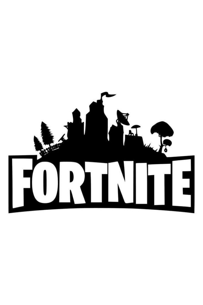
Since its explosive debut in 2017, Fortnite has become a global gaming phenomenon — and its logo is a big part of that story. The bold “FORTNITE” wordmark is instantly recognizable on game menus, billboards, and apparel, making it one of the most popular game logos of the modern era. Created in-house by Epic Games’ design team, the logo serves as a Battle Royale icon and a cornerstone of Fortnite’s visual identity. This article explores the logo’s origins, evolving design, symbolism, and how it has come to represent the vibrant community and culture around Fortnite.
Origins and Early Logo Design
Fortnite began as a co-op survival game codenamed Fortnight in 2011, a clever reference to two-week survival mechanics. The early logo reflected that concept through a playful, junkyard-style design. Each letter appeared hand-built from scrap materials — wood, metal, even old furniture — and the dot on the “i” was a crescent moon, suggesting nighttime defense and creativity (Fortnite Wiki).
This busy, detailed design suited the Save the World mode but lacked scalability. In 2012, the logo was simplified to a white wood-grain style: each letter looked like a plank of lumber held by black screws, keeping the construction theme but becoming easier to read.
By 2014, Epic Games introduced the version still in use today — a clean, bold, sans-serif wordmark in solid black or white (see Fortnite logo breakdown). This final iteration was optimized for digital screens, marketing use, and scalability, marking a shift from quirky survival to polished global brand.
♻️ Evolution Recap:
From 2011 to 2012, the Fortnite logo featured playful, “scrap-built” letters that looked as if they were assembled from discarded materials like wood and metal. This version was whimsical and rough, perfectly capturing the game’s original survival-building theme. A notable detail was the crescent moon used as the dot on the “i,” representing the idea of nighttime construction and defense.
In the period between 2012 and 2014, the logo underwent its first major refinement. The letters took on a white, wood-like texture with visible black screws holding them in place, maintaining the construction concept while greatly improving readability. This design was more balanced and easier to scale across various media.
Starting in 2014 and continuing to the present, Fortnite adopted its current logo: a bold, black sans-serif wordmark. All textures, moon imagery, and screw details were removed in favor of a clean, modern look that was both minimalist and striking. This version reflects Fortnite’s rise to global popularity and is versatile enough to appear across digital platforms, esports branding, and merchandise with consistent visual impact.
Visual Elements and Symbolism
The Fortnite logo uses a custom version of Burbank Big Condensed Bold — a heavy, cartoon-style font with subtle unevenness in its horizontal lines. This gives it a unique, playful edge while remaining highly legible and scalable across devices.
Its solid black or white color scheme projects simplicity and authority, making it adaptable for every platform — from mobile screens to merchandise. At times, Epic Games adjusts the color depending on the occasion (e.g. gold for events, blue for seasonal updates), but the core design remains intact.
Early versions carried subtle symbolism: the wooden planks and screws referenced Fortnite’s build mechanics, and the crescent moon hinted at the original co-op survival gameplay. In some versions, the letters appeared layered over landscape silhouettes — a nod to the game’s island map and terrain.
Epic Games Branding and Fortnite Identity

Epic Games treats the Fortnite logo as a central piece of its brand architecture. The design embodies Fortnite’s bold, fun, and creative spirit, aligning perfectly with the publisher’s focus on innovation in gaming.
The logo appears consistently across Fortnite’s title screen, menus, social media headers, merchandise, and esports events. This consistency builds strong brand recognition among both casual players and competitive fans.
As Fortnite evolves through seasons and crossovers, the logo serves as an anchor — instantly signaling authenticity, familiarity, and high production value. Its clean shape and flexible color palette make it ideal for blending with diverse promotional campaigns.
Merchandise, Community & Fan Culture
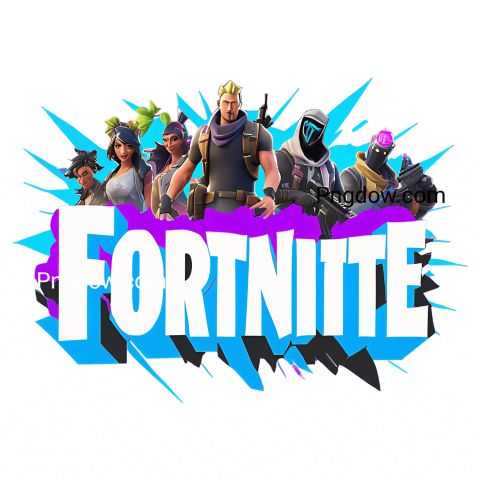
The Fortnite logo is everywhere — on T-shirts, hoodies, action figures, posters, and even cereal boxes. It’s not just a wordmark; it’s a symbol of belonging for fans.
Gamers proudly wear the logo as a badge of identity. Streamers use it in overlays, fans recreate it in digital art, and some even get it tattooed. It’s a visual cue that connects players around the world through a shared passion for the game.
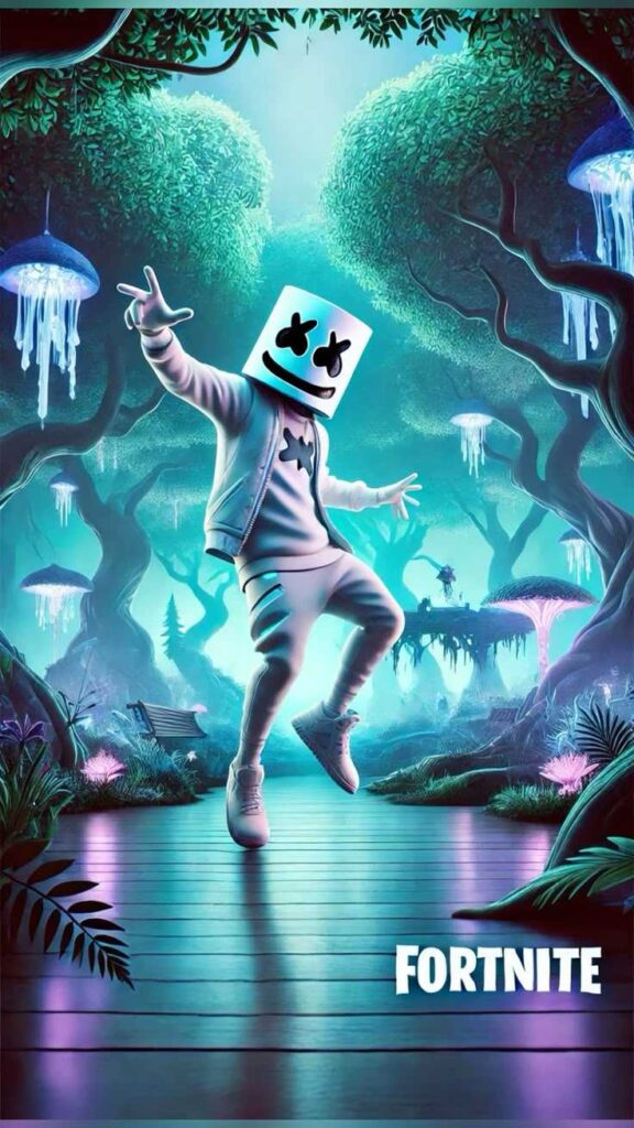
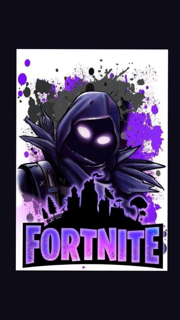
Epic also encourages personalization. Fans creatively redesign the logo in different art styles, add themed backgrounds, or incorporate it into fan-made thumbnails and wallpapers. The brand even releases alternate versions for events and tournaments — allowing players to express themselves without losing the essence of the Fortnite identity.
Explore the full range of Fortnite merchandise available in the official store.
Esports and Competitive Branding

Fortnite’s logo isn’t just used in casual settings — it’s deeply embedded in the competitive scene too. In every official tournament, the Fortnite esports branding is prominently displayed on banners, broadcast graphics, and even player jerseys.
This gives the logo dual power: it appeals to casual players while also representing excellence in esports. Organizers, teams, and content creators use the wordmark in highlight videos, promotional content, and posters, making it a unifying symbol across the Fortnite esports ecosystem.
Its presence at events like the Fortnite World Cup reinforces its role as a globally recognized icon in competitive gaming.
The Logo in Gaming Culture
Alongside brands like Minecraft, Call of Duty, and League of Legends, Fortnite’s logo has earned its place among best video game logos. It’s widely praised for being bold, simple, and adaptable — qualities that make it effective both visually and emotionally.
It’s a top reference in gaming logo design conversations. The font style, off-kilter cuts, and strong geometric shapes have inspired similar approaches across other games. Its minimalist confidence speaks to modern branding trends: less clutter, more impact.
Whether it’s on a streamer’s channel, a kid’s backpack, or an esports stage, the Fortnite logo is a beacon of gaming identity.
For more insights, see this analysis on Fortnite’s cultural impact.
Conclusion
The Fortnite logo is more than just a title screen — it’s a visual symbol of one of the most successful games in modern history. Its design evolution mirrors Fortnite’s journey: from quirky indie roots to cultural juggernaut.
Clean, confident, and instantly recognizable, the logo stands as a pillar of Epic Games branding and a rallying point for millions of fans. It bridges generations of gamers, uniting casual players, competitive pros, and passionate creators under a single visual identity.
Whether viewed as a design case study, a piece of merch, or an esports banner, the Fortnite logo will continue to represent fun, creativity, and community for years to come.
