The Dunkin logo is a great example of how brands use visual identity to stay current, relevant, and competitive in a changing world. Over the years, this iconic logo has gone through several design updates—not just to look modern, but to reflect deeper shifts in the company’s goals, audience preferences, and market trends. Each change in the logo tells part of Dunkin’s story, from a regional donut shop to a global coffee and beverage brand.
Logos are one of the most powerful tools a business has. They aren’t just images—they’re symbols of a brand’s values, personality, and promise. As markets evolve and customers demand more connection and clarity, brands often revisit their visual identity to ensure it still aligns with who they are and where they’re going.
Dunkin’ offers a textbook case of logo evolution done right. By examining how the Dunkin logo has changed over the decades, we can gain insights into the strategy behind brand design, the importance of visual consistency, and the smart use of simplicity in today’s branding landscape.

2. Timeline: Dunkin Logo Evolution
The Dunkin logo has gone through several transformations since the brand first opened its doors in 1950. Each version of the logo reflects a moment in the company’s journey—from its early focus on donuts to its modern identity as a coffee-forward brand. Let’s walk through the key phases of the Dunkin logo’s evolution and explore what each redesign says about the brand’s growth.
1950–1960: The Humble Beginnings
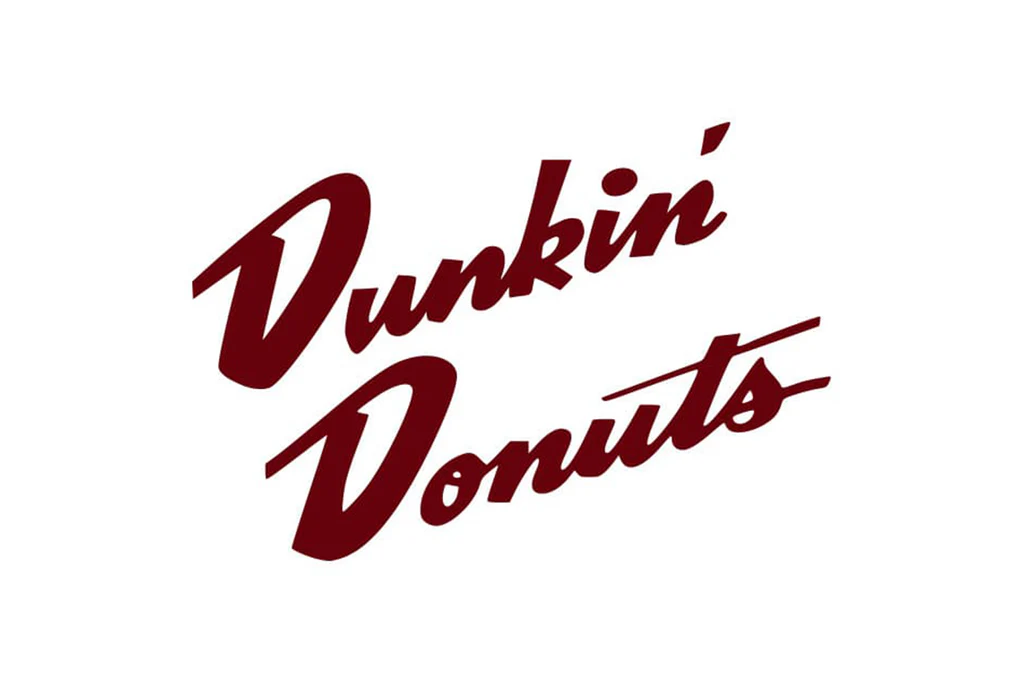
In its earliest form, the logo was simple and handwritten—reflecting the mom-and-pop charm of a small Quincy, Massachusetts donut shop originally called “Open Kettle.” When the name changed to Dunkin’ Donuts, the logo featured a red, serif-style wordmark that looked more like a diner sign than a global brand. It was functional but not particularly distinctive.
1960–1976: Introducing the Iconic Colors
This version marked the first real attempt at brand personality. The Dunkin logo adopted pink for the first time and introduced a coffee cup illustration alongside the text. The colors were bright, fun, and inviting—an early hint of the bold style Dunkin’ would become known for. This logo made the brand more recognizable and began to associate Dunkin’ visually with warmth and comfort.
1976–2002: A Bold, Sweet Identity
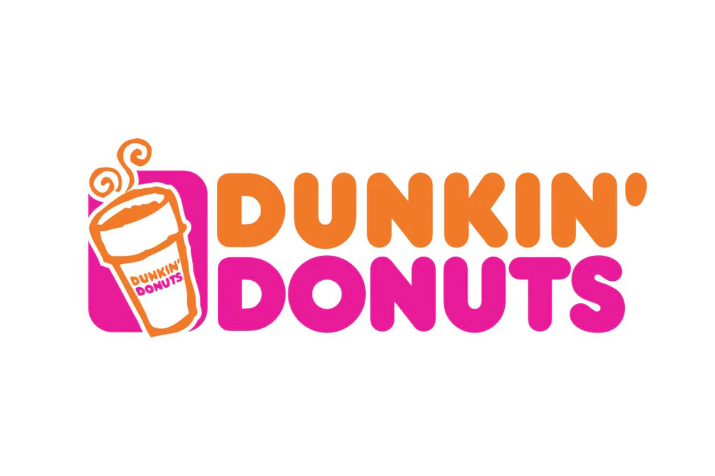
Designed by Lucia DeRespinis, this version of the Dunkin logo became a cultural touchstone. The bold, rounded orange and pink lettering—stacked in two lines—gave the brand a playful, instantly recognizable feel. It stood out on signage, packaging, and especially on those familiar pink donut boxes. This logo stuck around for over two decades and helped solidify Dunkin’s brand identity in America.
2002–2007: Enter the Coffee Cup
As Dunkin’ shifted focus toward coffee beverages, it updated its logo to include a steaming coffee cup above the name. This subtle but strategic move visually repositioned the brand—not just as a donut shop, but as a daily coffee destination. The cup illustration reinforced the idea that Dunkin’ wasn’t just about treats—it was about fuel for the day.
2007–2019: Refinement and the “DD” Monogram
This phase brought slight refinements, including a more stylized cup, stronger outlines, and the introduction of the “DD” monogram for use on digital platforms and branding materials. It was an evolution rather than a revolution, keeping the recognizable color palette while making the Dunkin logo more adaptable to mobile, web, and signage needs.
2019–Present: Simply “Dunkin’”
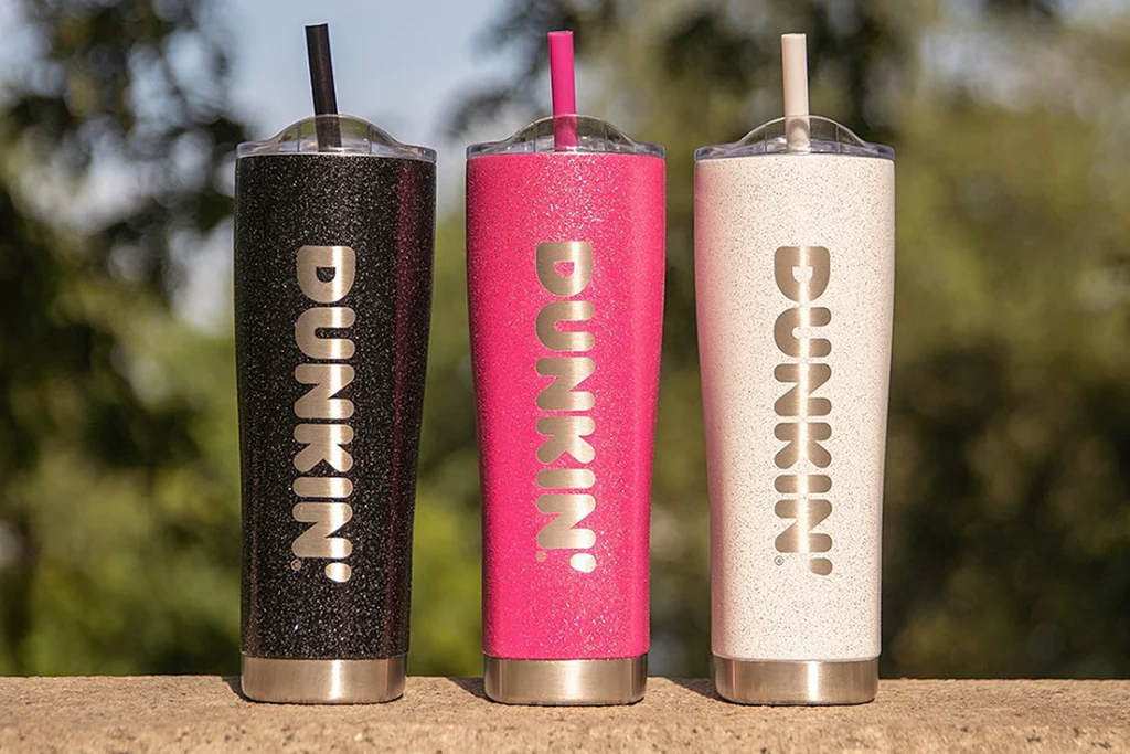
In a bold move, Dunkin’ dropped the word “Donuts” from its name—and its logo. The new design features a clean, modern sans-serif font in the classic orange and pink, but simply reads “Dunkin’.” This minimal approach reflects the brand’s broader menu and its position as a fast-paced, coffee-first chain. The simplified Dunkin logo works across all mediums and represents a confident, streamlined identity for the modern customer.
3. What Makes It Work: The Success Behind the Dunkin Logo
The Dunkin logo may look simple at first glance, but there’s a lot of smart design thinking behind it. From color choice to typography to brand positioning, every element has been intentionally crafted to make the logo both memorable and meaningful. So, what exactly makes it work so well?
1. Bold, Recognizable Colors
One of the most striking things about the Dunkin logo is its vibrant orange and pink color scheme. These aren’t random choices—they’re carefully selected to trigger emotional responses. Orange evokes energy, excitement, and appetite, making it perfect for a food and beverage brand. Pink adds a touch of warmth and friendliness, creating a unique contrast that helps the logo stand out from competitors in the coffee industry, which often lean into muted browns and blacks.
Together, these colors don’t just catch your eye—they create an identity you can spot from a distance, whether you’re driving past a storefront or scrolling on your phone.
2. Clean and Friendly Typography
The rounded, sans-serif font used in the current Dunkin logo conveys approachability and simplicity. There’s no fuss or flourish—just bold, easy-to-read lettering that reflects the brand’s fast, no-nonsense service. This kind of typography also scales well across all platforms—from large store signs to tiny app icons—making it incredibly versatile.
The typeface communicates that Dunkin’ is modern, efficient, and made for today’s busy consumer, without losing the fun energy it’s known for.
3. Simplification that Reflects Growth
When Dunkin’ dropped the word “Donuts” from its logo in 2019, it wasn’t just about cleaning up the look—it was a statement. The brand had outgrown its original identity as a donut shop. Coffee sales were dominating, and the menu had expanded to include everything from breakfast sandwiches to cold brews.
Simplifying the Dunkin logo to just one word mirrored this shift in focus. It showed confidence, adaptability, and alignment with a broader lifestyle brand that could go beyond baked goods.
4. Visual Consistency Over Time
Even with multiple redesigns, the Dunkin logo has maintained a strong sense of continuity. The color palette and general vibe have remained consistent for decades. This long-term consistency builds trust, recognition, and emotional connection with customers. It’s a great example of how a brand can evolve without losing its soul.
4. Designer Spotlight: The Woman Behind the Iconic Dunkin Logo
While logos often become cultural symbols, we sometimes forget there’s a real person behind the design. In the case of the Dunkin logo, one of its most recognizable versions—the vibrant orange and pink wordmark introduced in 1976—was created by a pioneering designer named Lucia DeRespinis.
Who is Lucia DeRespinis?
Lucia DeRespinis is a graphic designer and branding expert who was ahead of her time. A graduate of Pratt Institute and one of the few women working in branding during the mid-20th century, DeRespinis brought a unique blend of creativity, practicality, and boldness to her work.
She’s most famously known for creating the orange-and-pink Dunkin logo that would define the brand for more than 30 years. At a time when corporate logos often followed muted, conservative palettes, DeRespinis took a bold risk by pairing two loud colors—orange and pink—that weren’t traditionally seen together. That risk paid off.
Her Design Philosophy
DeRespinis believed that a logo should be instantly recognizable, functional in any size, and full of personality. She wanted Dunkin’s branding to reflect its cheerful, everyday appeal and appeal to a wide range of customers—from morning commuters grabbing coffee to families picking up weekend treats.
The rounded, friendly lettering and stacked layout she created gave Dunkin’ a visual identity that stood out in strip malls, on highway signs, and in coffee cups across the country. It was both playful and professional—exactly the image the brand needed as it expanded.
Her Lasting Impact
Though the logo has evolved since her original design, the core visual elements that Lucia DeRespinis introduced have remained. The orange and pink colors still anchor the brand, and the spirit of simplicity and friendliness she baked into her design continues to shape the Dunkin logo today.
In a branding world now filled with big agencies and digital teams, it’s inspiring to remember that one person’s vision can leave a decades-long imprint on a global brand.
5. Brand & Business Context: How the Dunkin Logo Reflects a Bigger Strategy
Behind every great logo is a bigger picture—a brand’s mission, market goals, and evolving identity. The Dunkin logo is no exception. Each change in the design wasn’t just a cosmetic tweak—it was a strategic response to the company’s growth, customer behavior, and business direction.
From “Open Kettle” to Dunkin’ Donuts: A Vision of Convenience

Dunkin’s story began in 1948 under the name Open Kettle, a small coffee-and-donut shop founded by William Rosenberg in Quincy, Massachusetts. Just two years later, the name was changed to Dunkin’ Donuts, inspired by the idea of dunking donuts into coffee—a catchy and clever way to promote the pairing of two simple products.

From the very beginning, the business focused on speed, affordability, and quality, which made it a hit with working-class Americans. The brand’s early logos mirrored this focus: simple, straightforward, and service-driven.
The Rise of Franchising and National Expansion
By the 1960s and ’70s, Dunkin’ Donuts began expanding rapidly across the U.S. through franchising. As the brand grew, so did the need for a strong and consistent identity. That’s where the iconic orange-and-pink logo by Lucia DeRespinis came in. It wasn’t just visually appealing—it gave Dunkin’ a recognizable face at a time when brand consistency across locations became a critical part of national expansion.
The bold, colorful Dunkin logo became a unifying symbol across thousands of stores, establishing visual trust with customers wherever they were.
The Shift Toward Coffee Culture
In the early 2000s, Dunkin’ recognized a major opportunity: the exploding demand for coffee. Competitors like Starbucks were dominating the premium coffee market, and Dunkin’ saw a chance to position itself as a more accessible, fast, and everyday coffee destination.
This business pivot directly influenced the logo. The addition of a steaming coffee cup to the Dunkin logo in 2002 signaled a shift in focus—from donuts to beverages. It was a clear message to customers: Dunkin’ wasn’t just about sweet treats anymore—it was where you get your morning fuel.
A Modern, Streamlined Identity for a Broader Market
By 2019, Dunkin’ had evolved into much more than a donut shop. The menu included espresso drinks, iced coffee, breakfast sandwiches, and plant-based options. To reflect this wider offering—and stay relevant in a mobile-first world—the company dropped “Donuts” from the name and logo entirely.
The current Dunkin logo, clean and minimal, reflects a brand that’s agile, modern, and built for convenience. It appeals to a new generation of customers while staying connected to its roots through consistent colors and tone.
6. Fun & Symbolic Facts: The Stories Behind the Dunkin Logo
Behind every logo lies a world of subtle symbolism, unexpected trivia, and cultural relevance—and the Dunkin logo is no exception. While it may seem like a straightforward brand mark at first glance, there’s plenty of charm and strategy baked into its design and history. Here are some fun and symbolic facts that give the Dunkin logo even more flavor.
1. The Original Store Still Exists
The very first Dunkin’ location, opened in 1950 in Quincy, Massachusetts, is still standing—and still operating. The original signage and design have been preserved as a tribute to the brand’s roots. Visitors can step back in time and see where the Dunkin journey (and the logo evolution) began.
2. Orange and Pink Was a Bold Experiment
The now-iconic orange and pink combo was considered a surprising choice back in the 1970s. At the time, most food and beverage brands leaned toward earthy tones or traditional red-white schemes. But Dunkin’s bright, energetic color palette made it stand out and has since become one of the most recognizable color duos in branding. It’s a great example of how a bold color decision helped shape long-term brand identity.
3. The Logo Helped Introduce “Munchkins”
When Dunkin’ introduced its famous Munchkins donut holes in the 1970s, the playful nature of the brand’s logo helped support the launch. The bright, friendly visuals were a perfect fit for marketing bite-sized, kid-friendly treats—and helped build trust with families.
4. “Dunkin” Without “Donuts” Was Years in the Making
Although the logo officially dropped the word “Donuts” in 2019, internal planning had been in the works for years. As early as the mid-2000s, the brand had started testing simplified branding in select markets. When the change finally rolled out, the Dunkin logo instantly became sleeker and more adaptable—especially for digital apps and mobile ordering.
5. Dunkin’s Pink Donut Box Is a Cultural Icon
Beyond the logo itself, the pink donut box is another piece of visual branding that has stood the test of time. Originally introduced to stand out on shelves and in offices, the box—and its matching logo—has become a staple in pop culture. You’ll spot it in movies, TV shows, and social media posts, all reinforcing brand recognition.
6. Global Tweaks for Local Markets
While the Dunkin logo is fairly consistent worldwide, the company does make slight adjustments depending on the region. In some international markets, the original “Dunkin’ Donuts” name is still used, and signage may reflect local language and cultural preferences. Still, the orange and pink palette ties everything back to the core identity.
7. Takeaways for Designers & Businesses: Lessons from the Dunkin Logo
The evolution of the Dunkin logo isn’t just a fun design story—it’s a masterclass in smart branding. For graphic designers, marketers, and business owners alike, there are several valuable lessons to take away from how Dunkin’ managed to modernize its image while keeping its core identity intact.
1. Bold Colors Can Build Brand Recognition
Dunkin’s bright orange and pink palette is one of the most instantly recognizable in the food and beverage world. It proves that bold color choices—when used consistently—can create a strong emotional connection and visual identity. Designers should think carefully about how color can reflect a brand’s personality and set it apart from competitors.
2. Simplicity Is Strategic, Not Boring
The most recent iteration of the Dunkin logo is incredibly simple—just the word “Dunkin’” in a clean, rounded font. Yet this simplicity makes it versatile, modern, and highly adaptable across digital and physical platforms. As brands expand into apps, social media, and global markets, a minimal logo becomes more practical. Sometimes, less truly is more.
3. Evolve with Purpose, Not Just for Trend
Dunkin didn’t change its logo just because it “felt outdated.” Each redesign was backed by business needs—whether it was to highlight coffee offerings, modernize for digital use, or reflect a broader menu. For any brand, logo evolution should always be guided by purpose and long-term vision, not just passing trends.
4. Keep Visual Continuity Where Possible
Despite multiple redesigns, the Dunkin logo has remained visually familiar thanks to consistent use of colors, tone, and overall brand vibe. This continuity builds customer trust. When refreshing a brand, keep core elements intact where possible—whether that’s a color scheme, shape, or voice—to maintain recognition.

5. Good Design Tells a Bigger Story
The most effective logos don’t just “look good”—they mean something. Dunkin’s evolving logo has reflected everything from morning convenience to cultural fun to mobile-first modern living. Designers should aim to craft logos that align with a brand’s mission, audience, and future—not just its present moment.
Conclusion
The story of the Dunkin logo is more than a timeline of visual updates—it’s a reflection of how smart branding evolves with purpose. From a handwritten sign outside a small donut shop in the 1950s to a sleek, modern logo seen in apps, billboards, and global storefronts, Dunkin’s transformation shows how logos can grow with the brand without losing their soul.
Each design choice—from color and font to name simplification—was tied to larger business goals and shifting consumer behaviors. What stayed constant was the brand’s energy, approachability, and its commitment to staying relevant without forgetting its roots.
For designers and business owners, Dunkin’s logo evolution is a valuable example of balancing tradition with innovation. It’s a reminder that great logos aren’t just artistic—they’re strategic, adaptable, and packed with meaning.
In a world where attention spans are short and competition is high, a well-crafted logo like Dunkin’s does more than look good—it communicates clearly, connects emotionally, and stays memorable for years to come.
