
Wingstop is a global fast-casual restaurant chain known for its bold, flavorful chicken wings. Operating in the competitive quick-service restaurant industry, it has carved a niche with strong branding, especially through the Wingstop logo.
In one sentence: The Wingstop logo captures the brand’s identity — speed, flavor, and nostalgia — through aviation-inspired design and vibrant color.
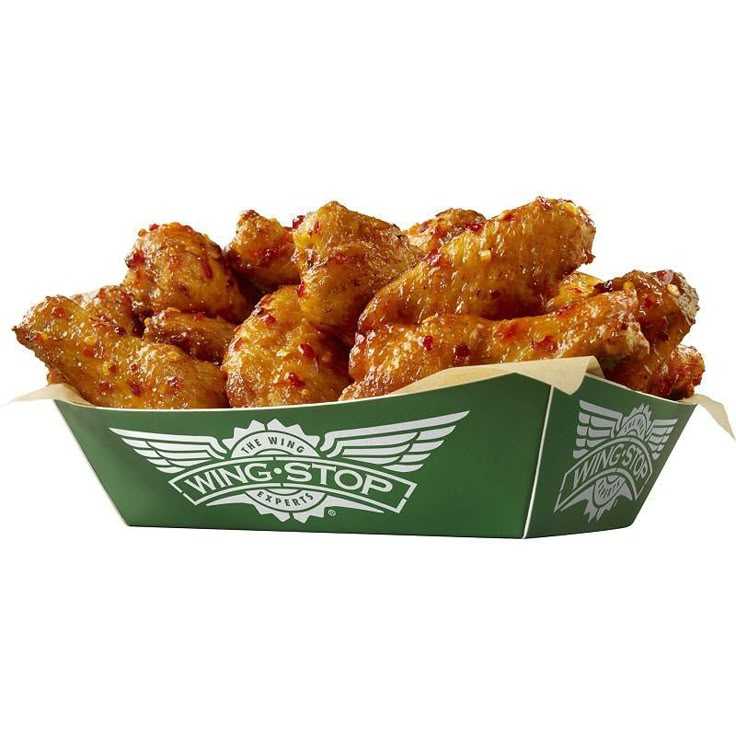
What Does the Wingstop Logo Mean?

The Wingstop logo is more than just an emblem — it’s a reflection of everything the brand stands for. Here’s what makes it meaningful:
- Wings: The large wings symbolize both chicken wings (the product) and airplane wings (the theme), combining the brand’s culinary and stylistic identities.
- Aviation Theme: The badge and banner-style layout are designed to resemble a vintage aviation insignia, fitting the chain’s classic 1940s airline hangar décor.
- Tagline “The Wing Experts”: This slogan (used in earlier versions of the logo) proudly declares Wingstop’s focus and specialty.
- Color Green: The signature green color conveys freshness, vitality, and flavor — helping the brand stand out in a sea of red-and-yellow fast food logos.
Together, these elements reinforce Wingstop’s identity as a fast, flavor-forward brand rooted in bold taste and retro charm.
2. Brand Origin & Founding Story
Founded in 1994 in Garland, Texas, by Antonio Swad, Wingstop began as a small wing-focused restaurant with a passion for aviation themes and retro ambiance. Inspired by the rising popularity of chicken wings and classic airline design, it overcame early market challenges by focusing on flavor innovation and brand consistency.
The History of the Wingstop Logo
1994–2014: The Original Badge
Wingstop’s original logo used a circular seal with wings on either side, bold serif text reading “Wing-Stop,” and the tagline “The Wing Experts.” It had a strong aviation badge look with a dark green color that felt bold and authoritative. The design gave off a premium, traditional vibe — perfectly suited to the brand’s roots.
2014–Present: A Sleeker, Brighter Look
In 2014, Wingstop refreshed its logo to align with modern branding trends. Key updates included:
- Brighter Green: The original dark tone was replaced with a more vibrant green for a fresher, more appetizing look.
- Simplified Lines: The emblem was cleaned up with less shading and a flat design aesthetic.
- New Typeface: Wingstop introduced a custom font called Sauce, inspired by spicy peppers, which adds energy and personality to the logo.
The redesign modernized the brand while staying true to its original theme — keeping the wings and aviation vibe intact but with a cleaner, more approachable twist.
Font and Color in the Wingstop Logo
Wingstop originally used a thick, bold serif font that communicated strength and reliability. With the 2014 rebrand, the new custom “Sauce” font brought a more dynamic and spicy energy to the name. Wide, sharp, and a little edgy, the lettering mirrors the kick of Wingstop’s signature flavors.
Color: Fresh and Unique
Most fast food chains rely on red and yellow to trigger hunger. Wingstop broke the mold by choosing green — a color linked to freshness, health, and excitement. The bright green shade, combined with crisp white accents, creates an inviting and modern look that’s instantly recognizable.
3. Mission, Vision, and Core Values
Wingstop’s mission is to serve the world flavor. Its vision involves becoming the global leader in flavor — not just in food, but in experiences. The brand stands on values like boldness, authenticity, and quality.
4. Target Audience
Wingstop primarily targets young adults and families, aged 18–35, who seek bold flavors, quick service, and a casual dining vibe. Its strong digital presence and flavor-driven branding resonate with a socially active, food-loving audience.
5. Brand Identity
- Name Meaning: “Wingstop” combines the product (wings) and the feel of a destination (stop), aligning with its aviation theme.
- Logo Design & Evolution: The Wingstop logo features winged emblems, a badge-style layout, and bold green tones. Since 1994, it has evolved from a detailed, vintage seal to a modern, flat design that still honors its roots.
- Tagline: “The Wing Experts” (earlier versions).
- Visual Theme: Bright green, crisp white accents, and a custom font called “Sauce” define its visual identity.
- Tone of Voice: Bold, playful, and confident — just like its flavors.
6. Products or Services
Wingstop offers a focused menu of chicken wings, tenders, fries, and dips. It’s best known for its signature sauces like Lemon Pepper and Louisiana Rub — creating a crave-worthy experience that stands out.
7. Brand Positioning & Differentiation
Positioned in the premium fast-casual space, Wingstop competes with brands like Buffalo Wild Wings and Popeyes. What sets it apart is its laser-focus on wings, distinct flavor profiles, and a strong brand identity led by its Wingstop logo and retro theme.
8. Marketing & Brand Strategy
Wingstop leverages a digital-first strategy, using social media, influencer partnerships, and app-based ordering. Its campaigns often highlight bold flavor, speed, and cultural relevance, paired with consistent visual branding rooted in the logo’s recognizable design.
9. Cultural Impact & Public Perception
Wingstop has made waves in pop culture through viral marketing, celebrity shoutouts (e.g., Rick Ross), and its memorable aesthetic. The Wingstop logo has become a symbol of quality wings and cool, fast-casual culture.
10. Customer Experience & Community Engagement
From in-store ambiance to mobile ordering, Wingstop emphasizes speed and satisfaction. It fosters a loyal community via social media engagement, flavor challenges, and exclusive promotions, often branded with its iconic logo.
11. Brand Evolution Over Time
Since 1994, Wingstop has expanded globally and rebranded in 2014 with a cleaner, brighter logo. The update modernized its look while keeping the aviation theme intact — ensuring the Wingstop logo remained central to its identity.
12. Milestones & Achievements
- Over 2,000 global locations
- Listed on NASDAQ in 2015
- Reached billion-dollar sales figures
- Numerous awards for growth and digital innovation
13. Social Responsibility & Ethics
Wingstop invests in community programs, promotes diversity and inclusion, and has made moves toward sustainable packaging. These efforts reflect growing consumer expectations for ethical business.
14. Conclusion
The Wingstop logo is more than a symbol — it’s a storytelling device that reflects the brand’s boldness, heritage, and commitment to flavor. As the brand continues to scale globally, the logo remains a central force in shaping its identity and legacy.